Why Fonts & B-Roll Go Hand-in-Hand in Storytelling
When we think of cinematic visuals, most of us focus on the camera, the lights, or the editing. But one subtle detail that often gets overlooked is typography. The font you choose for your titles, intros, or captions has a huge impact on how your project feels.
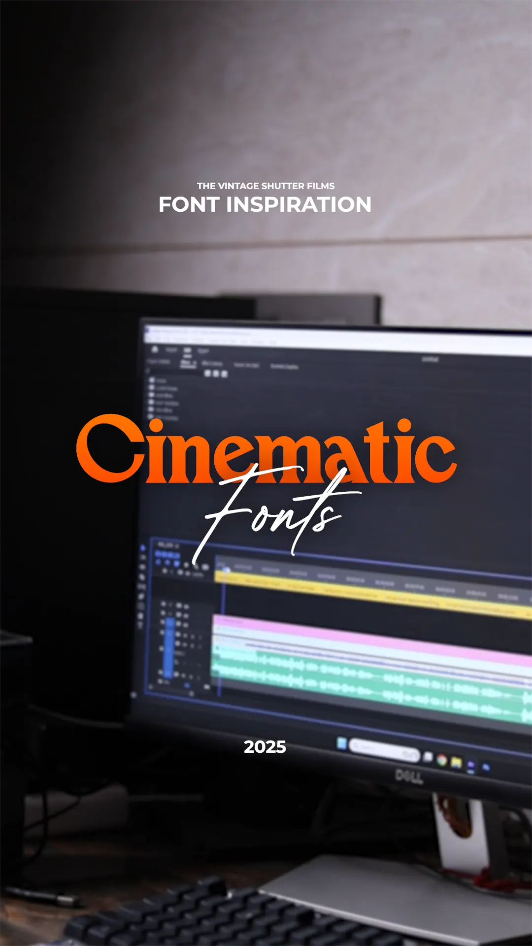
Recently, I created a video where I shared five of my favorite cinematic fonts that any creator can use. To make the experience more engaging for my audience, I also recorded B-roll shots of my setup — everything from wide frames of my desk to extreme close-ups of the computer screen, all bathed in a blue temperature light that gave the video a moody, cinematic tone.
This blog is a breakdown of that process: the fonts, why they work, and how I used different B-roll techniques to tell the story behind them.
Font 1: Palmore – Vintage Cinematic Charm
Palmore is the kind of font that immediately makes you think of old cinema posters or classic title cards. It has a bold but slightly vintage flair, making it perfect for projects that want to blend nostalgia with style.
- When to use it: Documentary titles, travel films, or projects with a retro theme.
- Why I love it: It doesn’t just tell your viewer what the title is — it sets the mood before the story even begins.
B-roll Setup: For Palmore, I used a wide shot of my entire desk setup. You can see the monitor glowing with the font displayed, while my equipment — camera, keyboard, and diffuser — fills the frame. The wide shot works like an establishing scene in a movie; it gives the audience context before we dive closer.
Download Link : https://ifonts.xyz/palmore-font.html
Font 2: Bebas Neue – Bold & Impactful
Bebas Neue has become a modern classic in the world of creators. It’s tall, bold, and clean — a font you’ve probably seen in countless trailers, action edits, and even YouTube intros.
- When to use it: Sports edits, action montages, music videos.
- Why I love it: Its simplicity makes it versatile. Even in all caps, it never feels cluttered.
B-roll Setup: I went in for a close-up shot of the editing screen. The text timeline was in sharp focus while the rest of the desk blurred softly in the background. This shot pulled viewers directly into the font itself, showing its bold lines without distractions.
Download Link : https://www.dafont.com/bebas-neue.font
Font 3: Editors Note – Elegant Storytelling
Editors Note is less common than the big names, but it has a distinctive personality. It’s more elegant, making it a great choice for films or videos where tone and detail matter.
- When to use it: Wedding films, storytelling edits, lifestyle content.
- Why I love it: It carries a sense of intimacy. It feels designed for moments where every word counts.
B-roll Setup: For this one, I experimented with an extreme close-up. I brought the camera so close to the monitor that you could almost see the pixel structure of the letters. Paired with the blue temperature lighting, it created an intense, moody vibe — the kind of detail shot that makes a tutorial feel cinematic.
Download Link : https://ifonts.xyz/editors-note-font-family.html
Font 4: Axiforma – Modern Versatility
Axiforma is one of those fonts that feels modern without being loud. It’s geometric and sleek, making it a reliable choice for tech videos or minimalist edits.
- When to use it: Corporate videos, social media edits, tech reviews.
- Why I love it: It adapts easily. Whether it’s a bold headline or a subtle caption, Axiforma fits.
B-roll Setup: I filmed a medium close shot of my hands on the keyboard as I typed “Axiforma” into the editing software. The camera caught the rhythm of the keys while the screen glowed softly in the background. These kinds of humanized B-roll shots give the audience a feeling of presence, as if they’re right there at the desk with me.
Download Link : https://dafontfinder.com/axiforma-font/
Font 5: Carol Gothic – Dramatic Gothic Edge
Carol Gothic is one of my personal favorites when I want something that looks mysterious and bold. Its gothic styling gives any project an edgy, cinematic look.
- When to use it: Thriller edits, dramatic trailers, or projects with a dark aesthetic.
- Why I love it: It transforms a simple word into a powerful visual symbol.
B-roll Setup: I returned to a wide frame shot, but this time the focus was on the blue temperature lighting. The cooler tones matched the gothic nature of the font, giving the whole frame a moody, cinematic finish. The diffuser I used softened the light so it wasn’t harsh, creating smooth shadows across the desk.
Download Link : https://www.onlinewebfonts.com/download/09d5772629cb46bc57208ddfd7b77f63
Why I Chose Blue Temperature Lighting
Across all five setups, you’ll notice the same cool, bluish tone. This was deliberate. Blue temperature lighting is often used in films to suggest calmness, night, or mystery. For this video, it made my entire desk setup feel more cinematic — like a studio, even though it was just my workspace.
I also used a diffuser to soften the light spots. Without it, the glare on the screen would have been distracting. With it, the light wrapped smoothly around the objects in the frame. Small details like this can elevate simple B-roll into professional-looking shots.
How B-Roll Complements Tutorials
Talking about fonts is valuable, but let’s be honest — if I had just spoken to the camera for the entire video, it would have felt flat. That’s where B-roll comes in.
- Wide shots establish the environment.
- Close-ups highlight details.
- Extreme close-ups add intimacy.
- Blue temperature lighting sets the mood.
Together, these shots made the tutorial feel more like a cinematic short film than a simple “top 5 fonts” video. That’s the magic of B-roll: it turns learning into an experience.
Final Thoughts
The fonts we choose aren’t just about design — they’re about emotion. Whether it’s the vintage charm of Palmore, the boldness of Bebas Neue, or the dramatic edge of Carol Gothic, each font adds a different layer of storytelling.
And by pairing these fonts with creative B-roll setups — wide frames, close-ups, extreme close-ups, and a moody blue tone — I was able to turn a simple font tutorial into a cinematic experience.
If you’re creating content, I encourage you to play with both. Test out fonts that match your story’s mood, and don’t underestimate how much a good B-roll shot can elevate your work. Because in the end, storytelling isn’t about one element. It’s about how fonts, visuals, and atmosphere come together to create something bigger.